
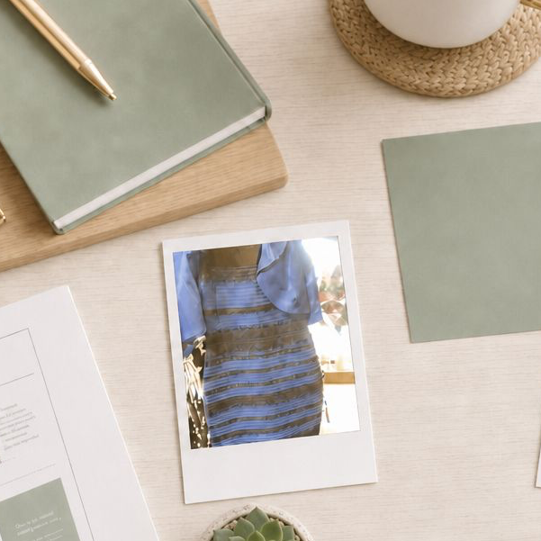
In February 2015, a Tumblr user posted a washed-out photo of a dress with a simple question: is this white and gold, or blue and black? Within days, the image had divided the internet, made its way onto morning television, and become one of the most studied optical phenomena in modern vision science.
I was working in live television production at the time, in a building full of people who thought about cameras, lighting, and color for a living. I was firmly team white and gold. One of our directors was just as firmly team blue and black. We argued about it the way only two people steeped in broadcast color correction can argue about it, which is to say with real conviction and a working knowledge of white balance.
I had a theory. The dress was photographed indoors, near a window. To my eye, the photo showed a white dress with a slight blue cast, and I suspected that cast was coming from the window light bouncing across it, something the camera hadn’t fully corrected for. If you mentally subtracted that blue tinge the way I assumed you should, you’d land on the dress’s real color underneath: white and gold. So I pulled the photo into Photoshop and used the color eyedropper tool to get an objective reading, certain it would settle the argument in my favor.
The pixels came back more blue than I expected. He thought they looked more beige than he’d been seeing too. We had both just watched our own eyes get corrected by data, in real time, and we’d each been wrong in our own direction.
It took me a decade to fully admit he’d been right. But the part that’s stuck with me far longer than the argument itself is what was actually happening when neither of us could see it correctly in the first place.
It Was Never The Camera, It Was Us
Here’s what I didn’t understand back then, sitting in that newsroom convinced I’d found a white balance problem in someone else’s photograph. The dress, examined directly, is blue and black. That part is settled. The white and gold perception that roughly two-thirds of viewers reported wasn’t a flaw in the photo. It was a flaw, or more precisely a feature, of human perception.
The phenomenon is explained by something vision scientists call color constancy, and the simplest way I can describe it now is this: your brain runs its own white balance function, constantly, on everything you look at, without ever asking your permission.
A white shirt looks white to you whether you’re standing under warm indoor bulbs or out in cool daylight, even though the actual light bouncing off that shirt is measurably different in each setting. Your brain is quietly discounting the light source to extract what it believes is the true color of the object underneath. It’s doing the exact correction I assumed a camera had done to that photo. Except it wasn’t the camera. It was me. My own visual system made an assumption about the lighting in that room, applied a correction based on that assumption, and then handed me a confident, fully formed answer that it never flagged as a guess. It just felt like seeing.
The dress photo was ambiguous enough about its actual lighting that different brains corrected in different directions, and two equally confident, equally sincere experiences came out the other side.
Two Assumptions, Two Realities
Researchers at MIT and Wellesley, led by neuroscientist Bevil Conway, found that the dividing line came down to assumptions about the light source in the photo. People who unconsciously assumed the dress was lit by warm, artificial light tended to mentally subtract that yellow cast, which pushed their perception toward the dress’s actual colors, blue and black. People who assumed it was photographed in cool, bluish daylight subtracted the blue instead, which pushed their perception toward white and gold.
A separate study from NYU neuroscientist Pascal Wallisch found a related pattern tied to whether people assumed the dress was lit from the front or backlit, closer to the window-light scenario I’d been arguing for that week. People who assumed backlighting were more likely to land on white and gold.
I had the right instinct about lighting being the culprit. I just had the correction running in the wrong place. It wasn’t the camera’s white balance I should have been suspicious of. It was mine.
Why Blue Specifically
Here’s the detail that genuinely surprised the researchers, and the one I find most interesting now. When Conway’s team digitally inverted the image, swapping every color for its opposite, the blue stripes became gold and the black stripes became blue. Shown this inverted version, nearly everyone agreed: those stripes were a vivid yellow. No debate. No newsroom argument required.
The disagreement vanished entirely once blue was removed from the equation. The researchers concluded that people are simply far more likely to discount blue specifically, more than yellow, red, or green, when working out a surface’s true color. Their theory is that this bias is built in for a practical evolutionary reason: blue light very often comes from an indirect source, like open sky or shade, rather than directly from the object itself. It makes sense when you think about how long human vision has had to contend with daylight. We’ve been compensating for the blue cast of the sky since long before anyone was arguing about a dress, or about anything at all.
The dress wasn’t a coin flip between two equally likely readings. It was a stress test for a specific, ancient bias in how the human visual system handles one particular color.
Do You and I See the Same Blue?
This is the part where I have to admit the research runs out, and something stranger and older takes over.
If two people’s brains can each run a confident, automatic white balance correction on the same photo and arrive at genuinely different colors, in different directions, with neither person aware that any correction happened at all, it raises an uncomfortable question that the dress didn’t invent but did make impossible to ignore. When you and I both look at something with no ambiguity to exploit, a bright, simple, unmistakable blue, are we actually having the same experience? Or are we both just applying the same word to two private experiences that have never been, and may never be, directly compared?
This is sometimes called the qualia problem, and color is the textbook example, because color is one of the few qualities of experience we can point to, agree to name, and still have no way to confirm we’re privately seeing the same thing. Do you and I see Cookie Monster’s blue identically? I have no idea. Neither does anyone else, yet. Maybe someday neuroscience finds a way to answer it. For now it sits exactly where the dress left it: unresolved, slightly unsettling, and proof that color was never just a decorative flourish.
What This Means For Anyone Working With Color on a Screen
I think about that newsroom argument from time to time now, for reasons that have nothing to do with internet trivia.
Every photograph carries the lighting conditions it was taken in, whether the photographer meant it to or not, and every brain looking at that photograph runs its own silent correction on top of it. A product shot taken under warm bulbs will read differently to different viewers depending on what each person’s visual system assumes about that light. A brand color captured in a photo rather than pulled directly from a digital file carries the same risk. Two people looking at the same image of the same red dress, the same green logo, the same blue paint swatch, may walk away with two different colors in their heads, and neither of them is wrong. They’re just each running the same ancient correction in a slightly different direction.
This is the actual reason a screenshot is more trustworthy than a photograph when you’re trying to communicate an exact color. A screenshot captures the color as it already exists on a screen, with no lighting conditions for anyone’s brain to interpret and discount. A photograph asks every viewer’s visual system to do the same unconscious work mine did with that dress: guess the lighting, then quietly correct the color underneath it, and never mention that a guess was involved.
Most of the time that system runs so smoothly nobody notices it happening. Once in a while, it doesn’t, and an entire newsroom spends a week arguing about a dress because of it.
What “The Dress” Taught Us About How Color Actually Works
Nicole
written by
You Might Also Like
In February 2015, a Tumblr user posted a washed-out photo of a dress with a simple question: is this white and gold, or blue and black? Within days, the image had divided the internet, made its way onto morning television, and become one of the most studied optical phenomena in modern vision science. I was […]
READ THE POST
Trust is not a conclusion. It’s a feeling. And online, it forms faster than most people realize. Research puts it at around fifty milliseconds for an initial visual impression, though the trust signals that follow in the first few seconds are what determine whether that impression holds. By the time a visitor has scrolled past […]
READ THE POST
Before you read a single word on a website, you feel something. That feeling — the one that happens in the first fraction of a second, before your conscious mind has processed anything — often comes from color. The brain responds to it almost instantaneously, faster than it processes language, faster than it evaluates layout […]

READ THE POST


