
Before you read a single word on a website, you feel something.
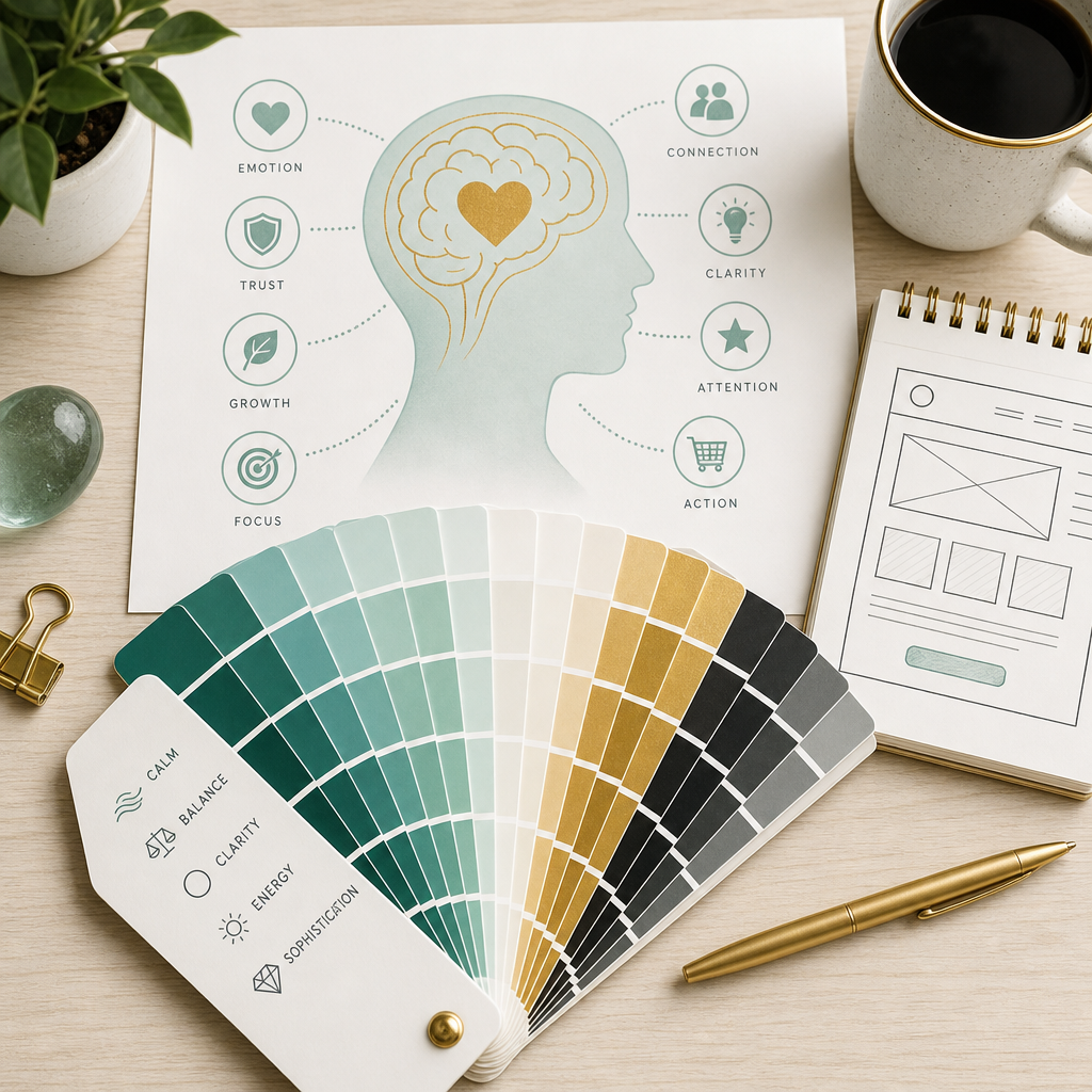
That feeling — the one that happens in the first fraction of a second, before your conscious mind has processed anything — often comes from color. The brain responds to it almost instantaneously, faster than it processes language, faster than it evaluates layout or navigation or content. By the time you’re actually reading, color has already done its work.
This is why color in web design is not a decorative decision. It’s a psychological one. And it’s one of the most powerful levers a designer has — and one of the most misunderstood.
Color Creates Atmosphere Before Content Creates Understanding
Think about how different spaces feel in real life. A dimly lit cocktail lounge creates an entirely different emotional response than a bright white hospital room. A warm, worn coffee shop feels nothing like a sleek luxury showroom. You don’t need to read a sign or hear an explanation — the environment communicates before anything else does.
Websites work exactly the same way.
Color establishes atmosphere before a visitor has read your headline, understood your offer, or decided whether they’re in the right place. Soft, warm neutrals suggest calm and sophistication. High-contrast palettes create energy and urgency. Dark, rich interfaces feel cinematic and immersive. Bright, airy ones feel open and optimistic.
Users aren’t consciously analyzing any of this. They’re simply experiencing it — and that experience becomes part of how they judge the brand behind the website before a single conscious evaluation has taken place.
What Colors Actually Communicate
Color associations aren’t arbitrary. They’re built from a lifetime of experience — environments we’ve lived in, objects we’ve touched, emotions we’ve felt in the presence of certain visual cues. While cultural context absolutely shapes interpretation, some patterns appear consistently enough to be genuinely useful.
Blue is the most widely used color in digital design, and for good reason. It communicates reliability, stability, and calm — which is why banks, healthcare brands, tech companies, and corporate platforms reach for it so consistently. Users associate it, almost subconsciously, with safety and intelligence. The risk with blue is emotional distance. Without warmth or contrast to counterbalance it, an all-blue palette can feel cold and impersonal — professional, but unreachable.
Red activates. It draws the eye faster than almost any other color and raises visual intensity immediately — which is why it works so well for calls to action, urgency-based messaging, and brands that want to feel bold and emotionally charged. The same quality that makes it powerful makes it exhausting in excess. Red is a color that demands restraint, or it becomes aggressive rather than compelling.
Green carries associations with nature, renewal, and balance — and sits at the intersection of calm and vitality in a way few other colors do. Muted, sophisticated greens feel luxurious and considered. Brighter greens feel energetic and fresh. It’s a remarkably flexible color, which is why wellness brands, financial platforms, and sustainability-focused businesses all reach for it despite how different those categories feel.
Black creates contrast better than anything else, and contrast is what creates hierarchy, emphasis, and the sense that a design is in control of itself. Luxury brands use black because it makes everything around it feel more intentional — the typography reads sharper, the imagery sits more powerfully, the white space breathes more visibly. The risk is coldness. Black without warmth or variation can feel less elegant and more severe, more closed-off than authoritative.
White Space Is Psychology Too
This one gets left out of color conversations almost every time, and it shouldn’t.
White space — the empty areas of a design, the breathing room between elements — is not the absence of design. It’s one of the most active psychological choices a designer makes. Generous white space tells the brain it doesn’t have to work. It reduces visual pressure, creates a sense of calm, and allows the things that are present to feel more considered and more important.
This is why minimalist websites often feel premium without being able to explain why. They don’t contain more design. They contain less visual noise — and the brain responds to that as clarity, which it associates with confidence, which it associates with quality.
Restraint is a form of communication. Silence in design has its own meaning.
Color Directs Attention — If You Let It
Color does emotional work, but it also does functional work. One of its primary jobs in web design is guiding the eye — creating a hierarchy of attention that tells visitors, without words, where to look first and what to do next.
This only works when most of the palette is quiet.
A single bright accent color against a muted base creates instant visual hierarchy. The eye moves to contrast naturally, before any conscious decision is made. But when everything is colorful — when every section competes with equal intensity — nothing stands out and the hierarchy collapses into noise. The visitor’s eye has nowhere to land, and attention without direction becomes attention that leaves.
Effective color systems almost always follow the same principle: a restrained base, one dominant accent, and enough discipline to let that accent do its job without competition.
Context Changes Everything
The biggest misconception about color psychology is that colors have fixed meanings — that blue always means trust, that red always means urgency, that black always means luxury. It doesn’t work that way.
A deep forest green can feel luxurious and editorial in one context and outdoorsy and casual in another. Bright yellow can feel playful and optimistic or visually overwhelming depending on how it’s used. Black can feel sophisticated or cold. The same color produces genuinely different responses based on everything around it — the typography it’s paired with, the imagery it lives alongside, the amount of space it’s given, the cultural context it exists in.
This is why great designers think in systems rather than individual colors. A palette isn’t a list of colors. It’s a set of relationships — each color doing a specific job, each one amplifying or softening the ones beside it, the whole thing working together to create a specific feeling in a specific person for a specific purpose.
Choosing a color because you like it is a starting point. Understanding how it will behave in context is the actual work.
What You Remember Is Never the Layout
People rarely remember the exact layout of a website they visited. They don’t carry a mental map of where the navigation was or how many columns the grid used. What they carry is a feeling — a general impression that accumulated during the visit and stayed.
Color is one of the primary forces behind that impression. Emotional reactions are more persistent in memory than visual details, which is why you can often remember how a website felt without being able to describe what it looked like. Some websites feel calm. Some feel sharp and confident. Some feel warm and approachable. Some feel expensive. Some feel alive in a way you’d struggle to articulate.
Color is quietly creating all of those impressions, often beneath the threshold of conscious awareness. It’s shaping how trustworthy the brand feels, how much energy or calm the experience carries, whether the visitor feels like this is a place for them. That’s not a small thing. That’s the difference between a website that a visitor remembers and one they don’t.The Practical Takeaway
If you’re evaluating a color palette — for a rebrand, a new website, or a refresh — the questions worth asking are not aesthetic ones. Not “do I like this?” but “what does this communicate, to the specific person I’m trying to reach, in the context of the brand I’m trying to build?”
A color that feels right to you may send a different signal to your ideal client. A palette you find too quiet may be exactly the right level of restraint for a premium audience. The goal is never a palette you love in isolation. It’s a palette that does the right psychological work for the right people — and earns their trust before they’ve consciously decided to give it.
Color is never just visual. It’s the first language your website speaks. Make sure it’s saying the right thing.
The Psychology of Color in Web Design
Nicole
written by
You Might Also Like
In February 2015, a Tumblr user posted a washed-out photo of a dress with a simple question: is this white and gold, or blue and black? Within days, the image had divided the internet, made its way onto morning television, and become one of the most studied optical phenomena in modern vision science. I was […]

READ THE POST
Trust is not a conclusion. It’s a feeling. And online, it forms faster than most people realize. Research puts it at around fifty milliseconds for an initial visual impression, though the trust signals that follow in the first few seconds are what determine whether that impression holds. By the time a visitor has scrolled past […]
READ THE POST
Before you read a single word on a website, you feel something. That feeling — the one that happens in the first fraction of a second, before your conscious mind has processed anything — often comes from color. The brain responds to it almost instantaneously, faster than it processes language, faster than it evaluates layout […]
READ THE POST


