
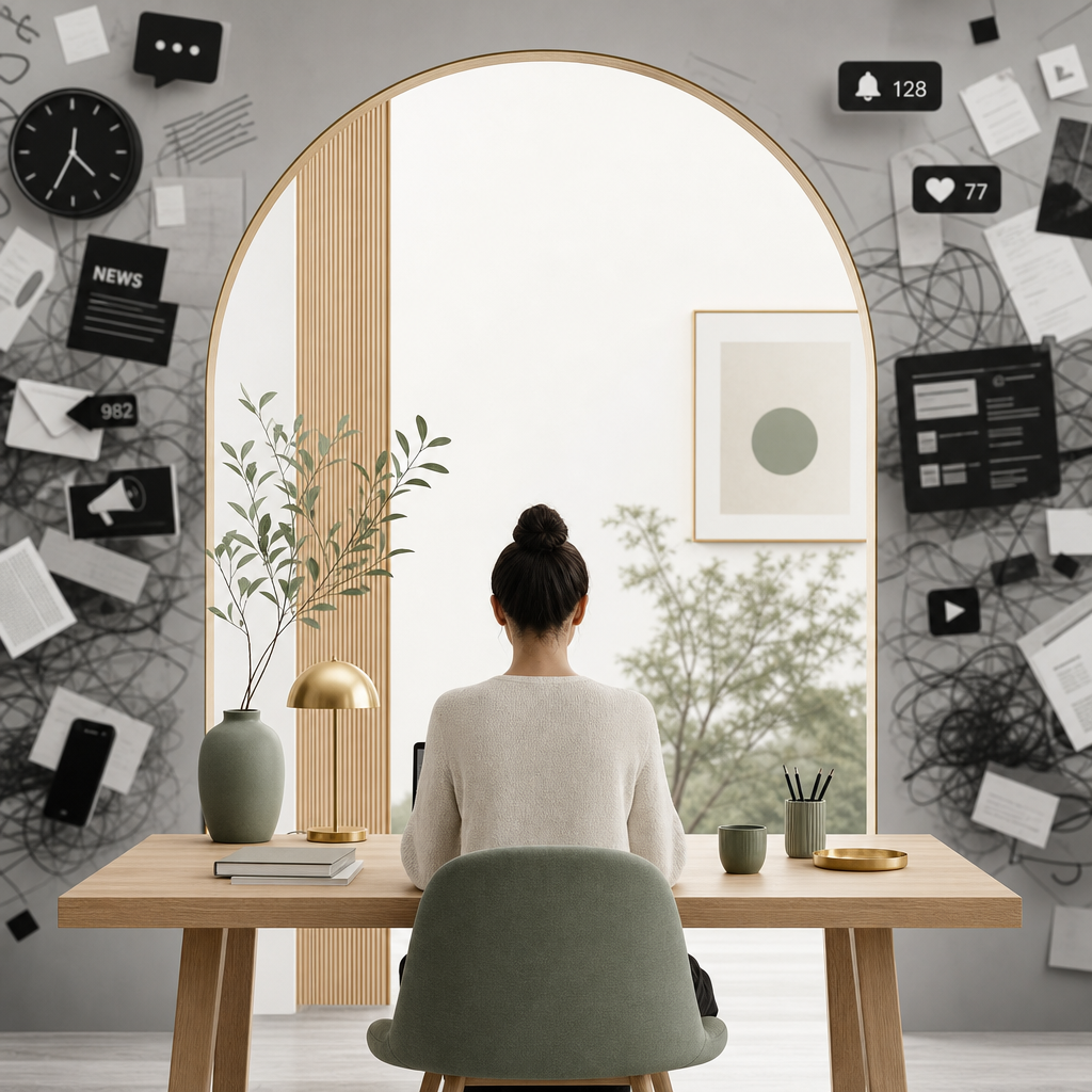
There is an entire category of merchandise built around the idea that the modern brain is running too many tabs at once. Mugs, tee shirts, tote bags, all variations on the same joke: 47 tabs open, half of them frozen, nobody knows which one is making that noise.
It’s funny because it’s accurate. And it’s accurate because the digital environment most of us live in has been designed, systematically and deliberately, to fragment attention rather than hold it. Every platform competing for the same finite resource, using the same playbook: more color, more movement, more urgency, more everything.
The irony is that more is exactly the wrong answer for a brand that actually wants to be remembered.
The websites that earn attention in this environment are not the loudest ones. They’re the ones that feel different from everything around them. And in a world of relentless stimulation, different increasingly means calm. Considered. Quiet in a way that reads not as absence but as confidence.
Designing for attention today means understanding that the most powerful thing a website can do is stop feeling like everything else.
PEOPLE SKIM. DESIGN FOR THAT.
Here’s something that changes how you think about every decision on a page: almost nobody reads websites. They skim them.
Visitors scan visually before they commit to reading. They’re looking for signals that tell them whether this page is worth their attention, whether this brand is speaking to them, whether there’s something here that justifies slowing down. Those signals are not delivered through paragraphs. They’re delivered through hierarchy: what’s large, what’s bold, what’s high contrast, what catches the eye first, second, third.
This is why visual hierarchy is not a stylistic preference. It’s a functional necessity. And it’s why one of the most important skills in web design is knowing not just what to emphasize but what to deliberately de-emphasize.
Some text on a website is small for a reason. Some information is lower contrast, quieter in color, reduced in visual weight. Not because it isn’t important, but because it’s designed to be found by the visitor who’s looking for it rather than noticed by everyone who isn’t. Legal information, secondary navigation, fine print, supporting details: these things belong on the page. They don’t need to compete with the headline for the same eyes.
When everything is equally visible, nothing is findable. The visitor’s eye has nowhere to prioritize and no sense of what matters most. The design that looks complete because every element is legible and prominent is often the design that communicates the least, because it’s asking the eye to do all the work of hierarchy that the designer should have done first.
Good hierarchy guides the skim. It lets visitors find what they’re looking for quickly, arrive at what the brand most needs them to see, and make a decision without having to work for it.
RESTRAINT IS A STRATEGY
There’s a version of restraint in design that’s about minimalism for its own sake, stripping things back until the page feels empty and calling it sophisticated. That’s not what I’m talking about.
Restraint as a strategy means making deliberate decisions about what earns a place on the page and what doesn’t. Every element you add competes with every other element for the visitor’s attention, and that competition has a cost. The more things competing, the less any single thing stands out. The less anything stands out, the harder the eye works to find a place to land. The harder the eye works, the sooner the visitor leaves.
A page with fewer elements, each one chosen for a specific purpose and given room to do its job, creates the opposite experience. The eye finds its footing immediately. The visitor knows where to look and what to do next. The experience feels effortless in a way that creates trust before anything has been consciously evaluated.
Restraint is not the absence of design. It’s design with the courage to leave things out.
WHITESPACE DOES MORE THAN YOU THINK
Most business owners, looking at a design with generous whitespace for the first time, want to fill it. The instinct is understandable. Empty space feels like wasted space, like something that should be saying something isn’t.
But whitespace is saying something. It’s telling the brain to relax. It’s signaling that there’s no pressure here, no urgency, nothing demanding attention that hasn’t earned it. In a digital environment where almost everything is designed to create a sense of urgency and overwhelm, that signal is powerful. It creates a kind of psychological exhale that makes visitors more receptive to everything that follows.
The brands that feel premium almost always use whitespace more generously than brands that feel ordinary. Not because luxury is defined by emptiness, but because restraint communicates confidence. A brand that gives its content room to breathe is a brand that trusts its content. Visitors feel that trust and it becomes their own.
PACING IS THE UNDERRATED ELEMENT
A website is not a static thing. It’s an experience that unfolds over time, and the pacing of that experience shapes how a visitor feels about the brand behind it.
Most websites pace badly. They front-load everything, delivering the full weight of the brand in the first scroll, then continuing at the same intensity all the way to the footer. The visitor never gets to breathe. There’s no rhythm, no variation between moments of emphasis and moments of rest, no sense that the page has been thoughtfully organized for the person moving through it rather than for the business presenting itself.
Good pacing works like good conversation. There are moments of weight and moments of lightness. Sections that make a strong point followed by sections that let it land. Visual complexity that gives way to simplicity, density that opens into space. That rhythm keeps visitors engaged not through stimulation but through something more sustainable: genuine interest in what comes next.
Designing with pacing in mind means asking, at every section, what does the visitor need to feel right now, and what do they need to feel next? That question changes how a page is built in ways that are invisible in a screenshot but immediately felt in the experience of moving through it.
ONE THING AT A TIME
Overstimulated design almost always makes the same mistake: it asks visitors to pay attention to too many things at once.
Multiple calls to action competing on the same page. Headlines and subheadlines and captions all weighted equally. Bold text so frequent it loses its emphasis. Animations on elements that didn’t need to move. Color used to decorate rather than to direct. The cumulative effect is a page where everything is important, which means nothing is.
Effective design in an overstimulated world makes a different choice at every turn. One primary call to action per page. One visual focal point per section. Bold used sparingly enough that it still means something when it appears. Motion only where motion earns its place by drawing the eye to something worth finding. Color as direction, not decoration.
Our own site is a good example of how this works in practice, because we made these decisions deliberately and can show our reasoning. The palette is white, grey, and greens: sea glass, sage, and a deep bottle green used as neutrals rather than accents. Greens read as calm and grounded in a way that most colors don’t, which means they give the site depth and warmth without competing for attention. All standard links and buttons use sea glass, shifting to sage on hover. Consistent, quiet, expected.
Then there’s one button that’s different. A warm terracotta, used exclusively for the primary call to action. Start the conversation. Get started. The wording changes depending on where it appears, but the color never does, and it appears nowhere else on the site except in one other place: as an underline on the word “you” in “we start with you” on the homepage. That’s it. Two uses. The rest of the site doesn’t touch it.
That restraint is the point. Because that color appears so rarely, it reads immediately as significant when it does. The eye finds it without being told to. It signals: this matters, this is what we want you to do next, without ever having to say so. The moment you use that color a third time for something less important, it loses the ability to do that work. It becomes part of the palette instead of a signal within it.
Color as direction, not decoration. One thing at a time. The principle is simple. The discipline required to maintain it, especially as a site grows and new pages get added, is where most designs quietly lose their way.
WHAT BUSINESSES LOSE WHEN THEIR WEBSITE ADDS TO THE NOISE
A website that competes with the overstimulated environment rather than offering relief from it doesn’t just fail to earn attention. It actively associates the brand with the thing visitors are most tired of.
When someone lands on a page that’s visually cluttered, tonally urgent, and demanding in the way that every other page they’ve visited today has been demanding, they don’t engage more deeply. They disengage faster. They’ve seen this before. It doesn’t feel like a brand with something specific to offer. It feels like more of the same.
The businesses that lose the most to poor design in this environment are often the ones with the most to offer. Genuine expertise, real results, a specific point of view that sets them apart. But if the website is adding to the noise instead of cutting through it, none of that gets communicated. The visitor leaves before they’ve had the chance to see what makes the business different, because the design didn’t give them a reason to stay long enough to find out.
That’s a significant cost. And it’s entirely avoidable.
THE COMPETITIVE ADVANTAGE OF CALM
Here’s what makes this moment interesting from a design perspective: because so many brands are responding to the attention economy by escalating, the ones that go the other direction stand out more than they would have at any other point in the history of the web.
Calm is now distinctive. Considered is now surprising. A website that feels like relief, that gives visitors permission to slow down and actually read, that trusts them to make a good decision when given good information without urgency or pressure, is a website that feels different from almost everything around it.
Different earns attention. It always has. The difference is that right now, in this environment, the most powerful kind of different isn’t louder or bolder or more visually complex. It’s quieter. More deliberate. More sure of itself than everything competing for the same eyeballs.
That’s a competitive advantage. And it’s available to any brand willing to make the harder design choices that produce it.
Even if those choices start with a tee shirt joke and end with a website that finally gives someone’s brain permission to close a few tabs.
Designing for Attention in an Overstimulated World
Nicole
written by
You Might Also Like
In February 2015, a Tumblr user posted a washed-out photo of a dress with a simple question: is this white and gold, or blue and black? Within days, the image had divided the internet, made its way onto morning television, and become one of the most studied optical phenomena in modern vision science. I was […]

READ THE POST
Trust is not a conclusion. It’s a feeling. And online, it forms faster than most people realize. Research puts it at around fifty milliseconds for an initial visual impression, though the trust signals that follow in the first few seconds are what determine whether that impression holds. By the time a visitor has scrolled past […]
READ THE POST
Before you read a single word on a website, you feel something. That feeling — the one that happens in the first fraction of a second, before your conscious mind has processed anything — often comes from color. The brain responds to it almost instantaneously, faster than it processes language, faster than it evaluates layout […]
READ THE POST


