
Typography is one of the most felt and least understood elements of design.
Most people can’t tell you why one website feels elevated and another feels cheap. They can’t name the fonts involved or explain the technical decisions behind them. But they feel the difference immediately, in the first second, before they’ve read a word, before they’ve consciously evaluated anything at all. Something about the letterforms, the spacing, the way the type sits on the page, registers as either considered or not.
That instinct is not arbitrary. It’s responding to something real. And understanding what it’s responding to is one of the most useful things a business owner can know about their own brand.
NOT EVERY FONT IS A GOOD FONT
This is where I want to start, because it’s the foundation everything else builds on.
There are thousands of fonts available today, more than at any other point in the history of typography, and the majority of them are not good. Not good for design in general, and especially not good for web design, where legibility, rendering across devices, and loading performance add an entirely separate layer of requirements on top of the basic question of whether a typeface is well-crafted.
A font that looks interesting as a display face on a poster may become unreadable at body size on a phone screen. A font that renders beautifully in print may look rough and inconsistent in a browser. A font that feels distinctive in one context may feel gimmicky in another. The decisions that go into choosing type for a website are not the same decisions that go into choosing type for anything else, and treating them as interchangeable is one of the most common ways a design goes quietly wrong.
So before we talk about what makes fonts feel expensive, it’s worth saying clearly: the first filter isn’t expense or aesthetics. It’s fitness for purpose. Does this typeface actually work for the context it’s going into? That question eliminates most of what’s available before the more nuanced conversation even begins.
WHAT “EXPENSIVE” ACTUALLY MEANS IN TYPOGRAPHY
When people describe a font as feeling expensive, they’re usually responding to a combination of things: refinement, restraint, specificity, and a quality of craft in the letterforms themselves that registers as intentional rather than generic.
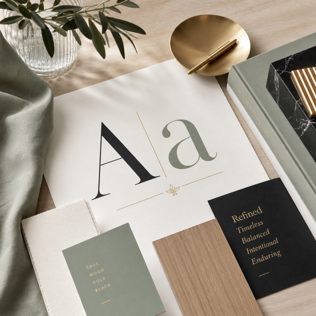
Expensive-feeling fonts tend to share certain qualities. High contrast between thick and thin strokes, the hallmark of classical serif typography, signals craft and tradition. Generous, considered letter spacing creates an unhurried quality that reads as luxury. Distinctive but disciplined details, a particular curve, an unusual terminal, a ligature that reveals itself only on close inspection, suggest that someone spent real time on the design of each individual character rather than producing something functional and moving on.
These qualities are not exclusive to expensive fonts. That’s the first nuance worth understanding.
—
THE THREE CATEGORIES WORTH KNOWING
Fonts that feel expensive and aren’t.
Some of the most elegant typefaces available are free, and not free in a compromised way, free in a genuinely well-crafted way. Google Fonts has improved dramatically over the years and now includes typefaces that are optically refined, historically grounded, and beautifully rendered across devices. The lesson isn’t that free fonts are as good as premium ones across the board. It’s that price and quality are not the same axis. A free font chosen with genuine understanding of what it’s communicating will always outperform an expensive font chosen carelessly.
Fonts that are common but can still feel expensive.
Some typefaces are ubiquitous, used across thousands of websites and brands, and yet still read as elevated in the right context. This is because quality is quality. A well-designed typeface doesn’t become less well-designed because many people use it. What determines whether it feels considered is not the font itself but the decisions surrounding it: the size, the weight, the spacing, the pairing, the restraint with which it’s used. The mistake is assuming that a common font is automatically a weak choice. The question is always whether it’s being used thoughtfully.
Fonts that feel expensive and actually are.
Then there are the typefaces where the feeling and the price are genuinely connected, where what you’re paying for is specificity, exclusivity, and a level of craft that simply doesn’t exist in the free tier. Independent type designers and foundries produce work at this level, and the difference is visible to anyone who knows what they’re looking at: more sophisticated optical corrections, more complete character sets, more distinctive details, and the simple fact that fewer brands are using them.
This is territory we love at Kismet. We have a particular affection for the work of Jen Wagner Type, an independent type designer whose fonts sit squarely in this category. On this very site, our headlines are set in Royals Thin and Royals Thin Italic, elegant, high-contrast, and quietly confident in a way that immediately signals intention. Golden Hopes handles our eyebrow text, where its distinctive character adds personality without competing for attention. Sweet Sans Pro carries the body copy and buttons, clean, readable, and versatile enough to let the display faces do their work without interference.
That stack didn’t happen by accident. It came from understanding what each typeface does well and what it does to the typefaces around it. Which brings us to the part of this conversation most designers skip.
TWO GREAT FONTS CAN STILL BE WRONG FOR EACH OTHER
This is the insight that changes how most people think about typography, and it’s the one that gets left out of almost every conversation about font selection.
A typeface being beautiful doesn’t make it right. Two beautiful typefaces placed together doesn’t make them a pairing. Some fonts, regardless of their individual quality, exist in different visual universes: different historical periods, different emotional registers, different structural sensibilities. Placing them together creates a dissonance that the eye registers immediately, even if the brain can’t articulate why.
Think of it like casting. Two extraordinary actors don’t automatically have chemistry. The question isn’t whether each one is talented. It’s whether they belong in the same scene together.
This is why we work from font pairing guides rather than font libraries. When a client project reaches the typography stage, we don’t hand over a link to Google Fonts and let them browse. That way lies chaos, hours spent looking at fonts in isolation with no framework for how they’ll work together or whether they’re right for the brand. Instead, we develop a small number of considered directions, each with a primary display face and a complementary body font, shown together in context, with a guide that explains what each pairing is communicating and why.
Usually we present two directions. Both are good. The client chooses the one that feels most true to the brand they’re building.
KNOWING THE RULES AND KNOWING WHEN TO BREAK THEM
Typography has rules. Contrast between display and body faces. Limiting the number of typefaces in a system. Avoiding fonts from the same historical period that are too similar to create hierarchy but too different to feel cohesive. These rules exist because they reflect real principles about how the eye processes information and how type creates meaning.
But rules in design are not laws. They’re starting points.
Knowing a rule deeply enough to understand why it exists is what gives you the judgment to break it when breaking it is right. A pairing that shouldn’t work on paper sometimes works beautifully in context, because the brand it’s representing has something unusual about it, or because the tension between the typefaces creates exactly the right feeling, or because the designer understood the rule well enough to know this was the exception.
This is one of the things that genuinely separates experienced designers from people who know how to use design tools. Tools can apply rules. They can’t tell you when a rule is the wrong one for this particular brand, this particular client, this particular moment. That judgment comes from years of looking, making, and caring enough about the craft to understand what the rules are actually protecting.
A NOTE ON LICENSING
If a project calls for a premium typeface, something outside the free tier, clients purchase their own font license directly. Not through us. In their name, on their account.
This matters beyond the legal dimension, though the legal dimension is real. A font license is a brand asset. It should live with the business that owns the brand, not with the designer who chose it. When the website gets updated or redesigned years from now, the license travels with the client. We walk clients through exactly what they need and where to get it, but the purchase and the ownership are always theirs.
WHAT TYPOGRAPHY IS ACTUALLY DOING
Typography is not decoration. It is not a finishing touch applied after the real design decisions have been made. It is one of the primary ways a brand communicates who it is, before the copy is read, before the images register, before the visitor has made any conscious evaluation at all.
The difference between type that feels considered and type that feels generic is the difference between a brand that reads as intentional and one that reads as assembled. Between something that came from a specific place with a specific point of view and something that could belong to anyone.
That distinction is felt in seconds. It shapes everything that follows. And it starts with someone who knows the rules well enough to use them, and when necessary, to set them aside.
Why Certain Fonts Feel Expensive
Nicole
written by
You Might Also Like
In February 2015, a Tumblr user posted a washed-out photo of a dress with a simple question: is this white and gold, or blue and black? Within days, the image had divided the internet, made its way onto morning television, and become one of the most studied optical phenomena in modern vision science. I was […]

READ THE POST
Trust is not a conclusion. It’s a feeling. And online, it forms faster than most people realize. Research puts it at around fifty milliseconds for an initial visual impression, though the trust signals that follow in the first few seconds are what determine whether that impression holds. By the time a visitor has scrolled past […]

READ THE POST
Before you read a single word on a website, you feel something. That feeling — the one that happens in the first fraction of a second, before your conscious mind has processed anything — often comes from color. The brain responds to it almost instantaneously, faster than it processes language, faster than it evaluates layout […]

READ THE POST


